The Problem
Lunch Money Buddy was developed to help streamline the lunch-buying process and ensure users of all technological comfort levels can provide a healthy lunch to children in their care. The following goals were established:

Funding
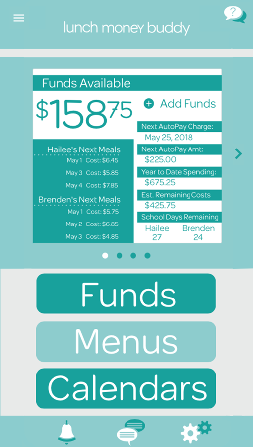
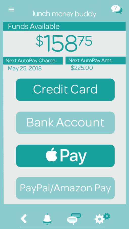
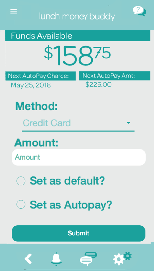
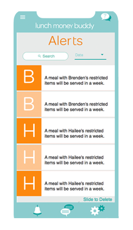
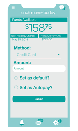
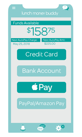
Add funds to the account via multiple payment options & setup automatic payment methods

Subsidy Info
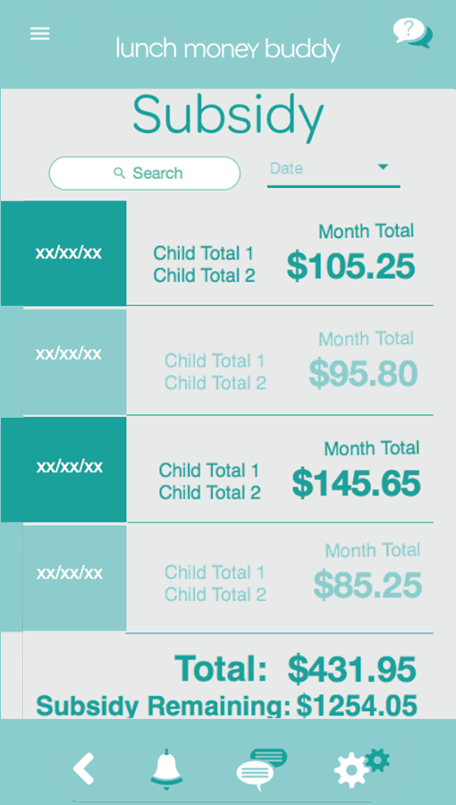
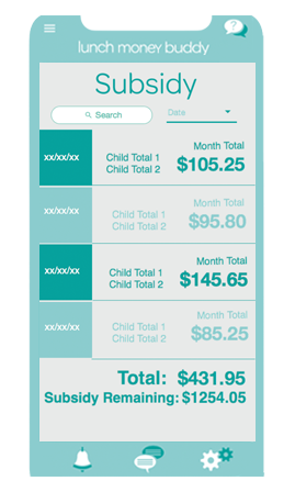
Quickly view subsidy information for the current year and access previous information

Multiple Menus
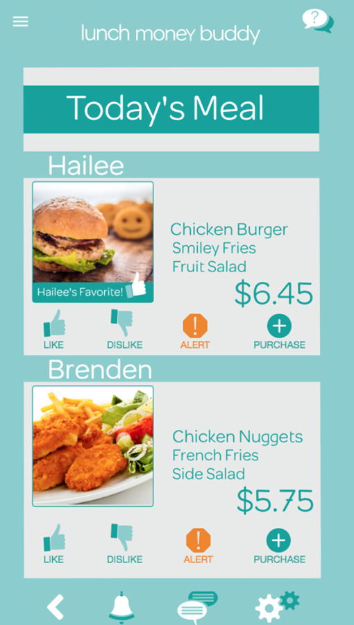
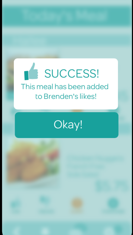
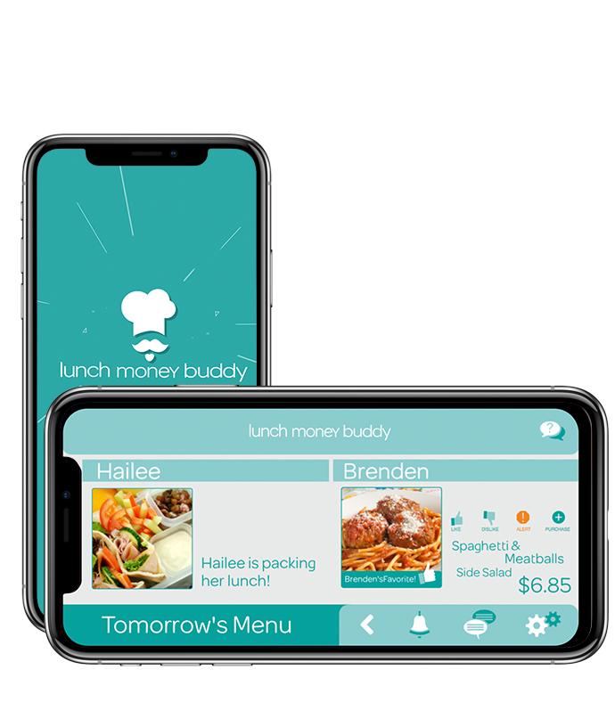
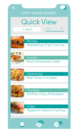
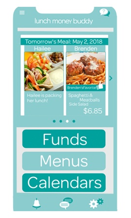
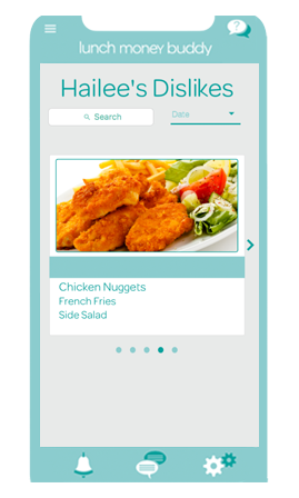
Access menus for indvidual for multiple schools & children. Denote a child's favorite meals

Mobile Access
Provide critical information quickly for parents on-the-go with hectic, busy lifestyles

Ease of Use
Simple, straightfoward interface for every user's technological comfort level

Low Balance Alerts
Warn users of a low balance so children do not miss a lunch while at school
Actions
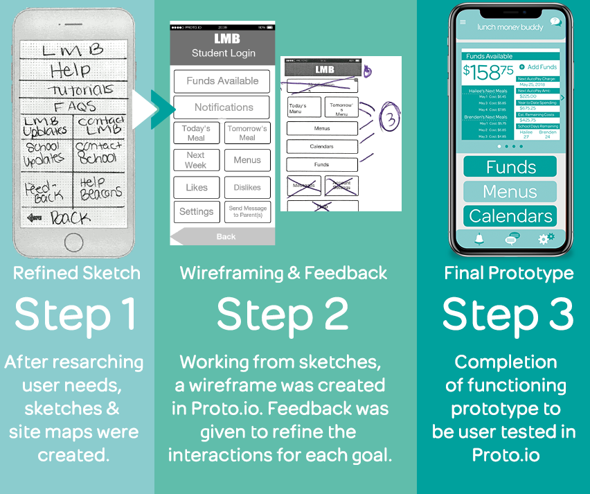
The following steps were taken during the development of the Lunch Money Buddy mobile application. Feedback was given at each step, causing multiple iteration and ideation sessions.
Research
During the research phase, personas were reviewed and essential goals were established based on behavior, lifestyle, and technological comfort level.
Mobile application research was completed using successful app such as Facebook and Huntington Bank. 81% of mobile application users have Facebook, so the interface is familiar to a wide audience. The primary users of Lunch Money Budy are parents and guardians of school-aged children. In the United States, 64% of Facebook users are over age 25, adding further support to utilizing a similar layout and features.
Sketches & Site Map
Muliple sketching sessions created the Lunch Money Buddy's early interface. During these sessions, feedback was given on the flow of information, the clarity of the interaction, and the solutions presented. Intial, rough sketches led into refined sketches utilizing a mobile phone template. For this project, the iPhone 6, 8 Plus, and X were used interchangably to explore solutions across the iOS platform. The site map guided guided the creation of screens and their connectivity.
Protoype
Once all the feedback was considered and applied to the wireframes, the final solution was created from the wireframes. Fonts were considered, color schemes were decided upon, and graphics were created for the final prototype. During this phase, it was important to keep the underlying wireframe's functionality clear as it was the foundation to be built upon. The design of the protoype could not compromise the interactions previously created.
Results
The final prototype is can be viewed via Proto.io
Below you will also find a promotion video and select screenshots.

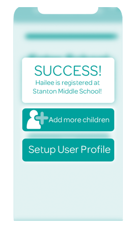
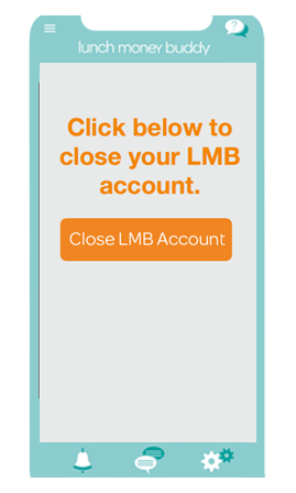
Lunch Money Buddy Screenshots
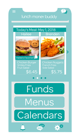
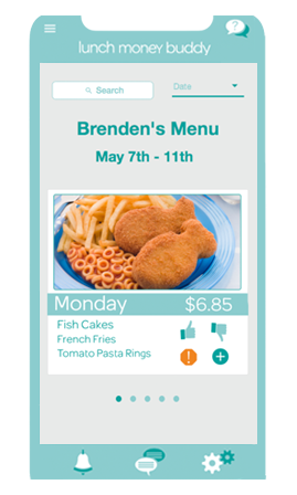
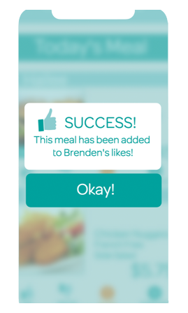
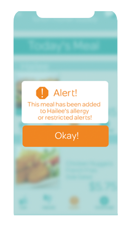
85
Screens122
Screens including Interactions394
Assets Generated4
DeliverablesLessons
This project was very challenging for me in the following ways:
Losing sight
I started to think too big. I had to go back to the beginning and remind myself of the original purpose of the app. I revisited the goals and was sure to address each problem.
Reduce!
Similar to losing sight, I need to remember to reduce. Several areas were information heavy and by thinking about the user's needs I was able to combine information and reduce the user's cognitive load.
Details!
While I wanted to include biometric options for iPhone, for the first half of the wireframes I was adding a TouchID to an iPhone X which uses Face ID. Thankfully my group's feedback caught the error. Such a detail could derail a projet when it comes to building the app.
Proto
Learning Proto was definitely a challenge. However, it is a very helpful tool to wireframe and create functioning prototypes. I have already begun looking into pricing for use in my classroom in Spring 2019.


